How user testing can change your life
What is user testing and how to get started

Last modified
Once your brand new website is launched do a round of user testing. Seriously, do it. You will glean fascinating insights from the process and shine light on a few blind spots.
What is user testing?
User testing means testing your site or application with actual users in order to find areas for improvement. This can involve recruiting a neutral outsider, sitting them in front of your new site, asking them to complete a series of tasks, recording the session and then reviewing the points of confusion with your team. It can also mean using a platform like UserTesting.com to recruit qualified participants according to specific criteria, submitting a script for the test and then downloading video recordings of participant experiences on your site.
How many users should you test?
Qualitative usability tests of this nature do not require large sample sizes to be useful. Usability expert Jakob Nielsen recommends testing with no more than 5 users. The reason is that insights start to repeat when testing on larger sample sizes, leading to diminishing returns on budget:
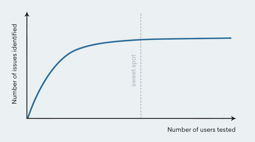
As Steve Krug aptly explains:
Imagine you work in an office, and there is a piece of frayed carpet just outside your cubicle. A co-worker walks by and trips on the carpet. 10 minutes later, another co-worker trips. And an hour later, another co-worker trips. Do you really need a large sample size to know there’s a problem with the carpet?
What you should test
Here are various elements of your site you can test (either via one test or a series of tests):
- Home page impression
- Task completion (eg. ordering a product or completing a form)
- User journey through your site (what users click on next and how they progress through your site)
- Likes and dislikes of the site
- Areas of frustration or confusion
- Comparison to competitor sites
You will have ‘facepalm’ moments
The first time we tested our site years ago, it blew our mind how many blind spots we had. For example, testing revealed that people were confused by our project enquiry form. The form asked users to disclose whether they were interested in web development or other graphic design services, which was a mandatory field:
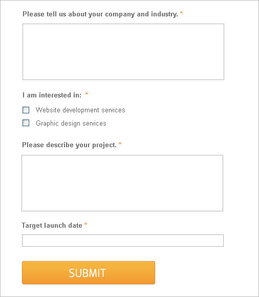
However, many users interpreted this field as a newsletter subscription tick box, refused to select an option and were then upset to find that the field was mandatory. A very simple rewording exercise from “I am interested in” to “My project relates to” solved the problem:
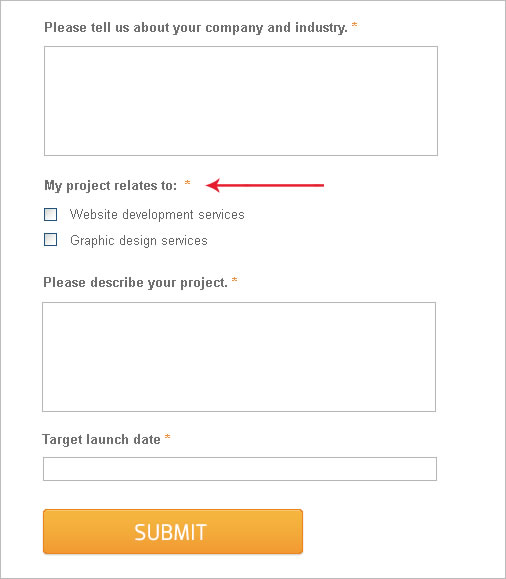
Had we not identified the issue early on via user testing, this mistake might have driven away valuable business.
At first, you may cry

The first few rounds of testing may reveal some frank, harsh criticisms. You may find that users may have many points of frustration or completely miss the boat on what you offer. Be prepared for scathing reviews and don’t despair. As Conversion Rate Experts put it:
The best user tests will leave you in tears.
Simply focus on fixing the main issues identified and iteratively re-test your site.
You will improve conversions
Ultimately, user testing reveals the bottlenecks on your site so that you can fix key issues and improve conversions. Conversion Rate Experts share a range of fascinating case studies on their site on this topic.
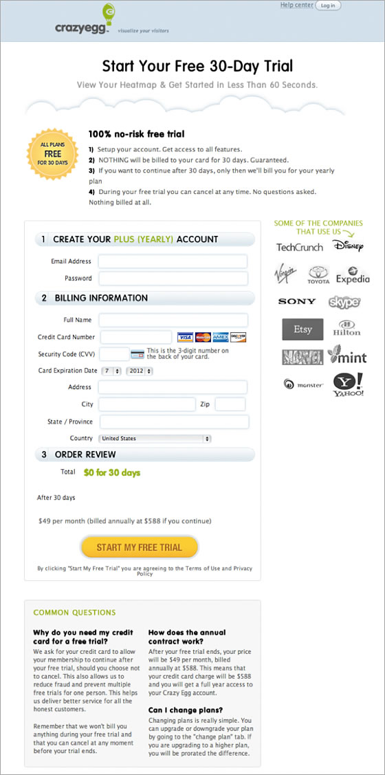
In one case study, the company increased sign-ups for the client Crazy Egg by adding trust symbols to the checkout page and addressing user objections. The original sign-up page looked like this:
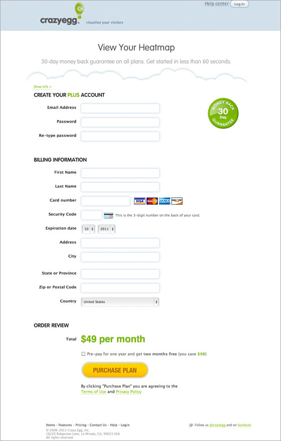 Source: Crazy Egg case study
The revised page, based on issues identified in user testing, featured client logos, clearer wording and answers to common questions:
 Source: Crazy Egg case study
This design change lifted sign-ups by 116%, as revealed via split testing.
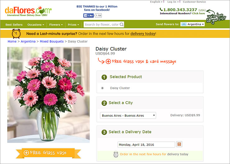
In another case study, user testing revealed that daFlores customers were not aware of the company’s same day flower delivery service, and were unsure if gifts would reach recipients in time. By adding a countdown timer to the site with explanations, visitors became aware of this benefit and were motivated to complete their purchase. This tweak resulted in a 27% increase in orders. Read the full case study here.
As the above examples show, small changes can have disproportionately large impacts.
Summary
If your company’s analytics programme only encompasses quantitative data at this stage (eg. Google Analytics stats) it’s time to add qualitative data to the mix. A good corporate analytics programme should include both ‘quant’ and ‘qual’. As Avinash Kaushik explains in his book, quantitative data can tell you what happened. Only qualitative data can tell you why:
Combining the what (quantitative) with the why (qualitative) will provide a company with a long term strategic competitive advantage. (Source)
Here are other qualitative data sources to supplement your analytics programme:
- Conduct on-page user surveys via Qualaroo
- Send out open ended survey questions via Typeform
- Chat to your customer support team for insights into common end user issues
- Become a customer on your own site and complete the user journey from A to Z
Please share your user testing experiences below! Did you laugh? Did you cry? What did you learn?

If you are looking for a website revamp, drop us a line. We’d love to connect.

